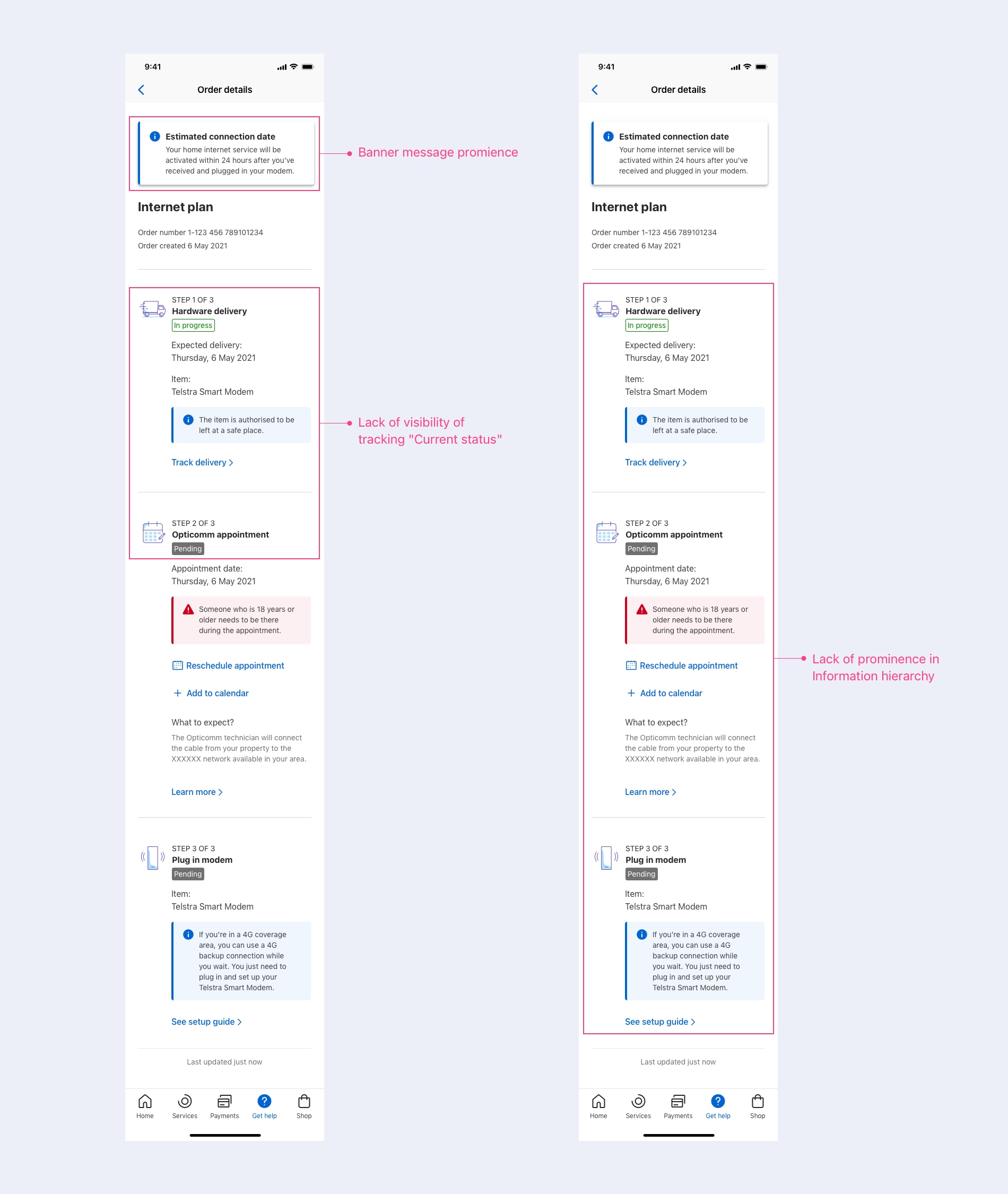
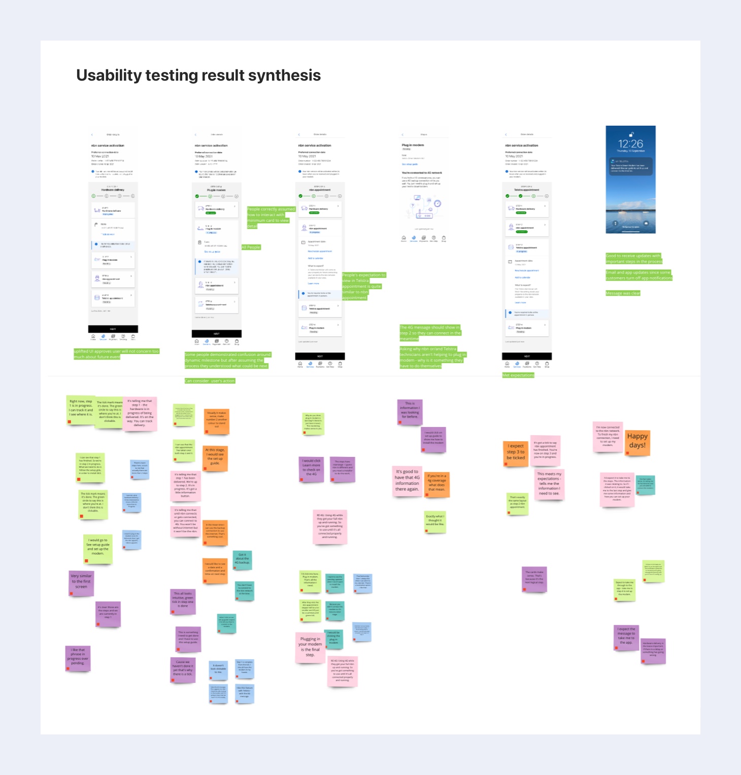
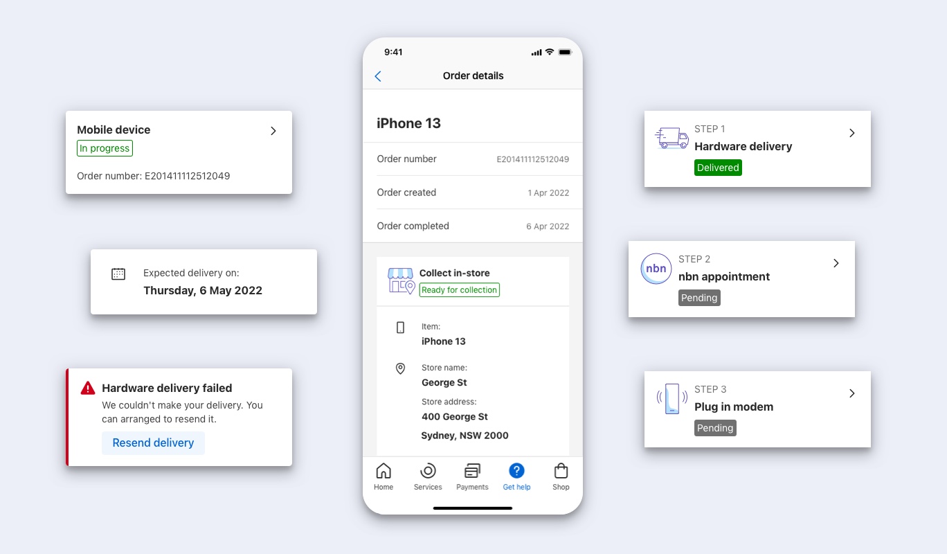
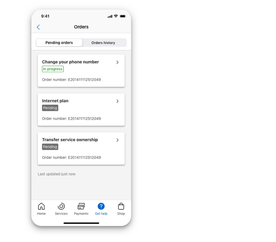
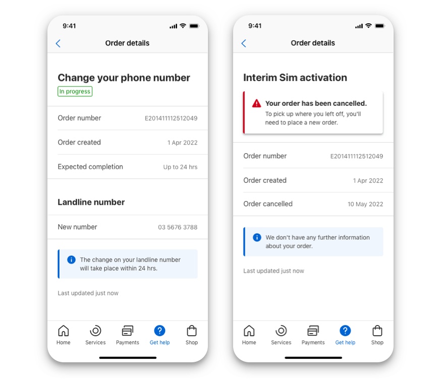
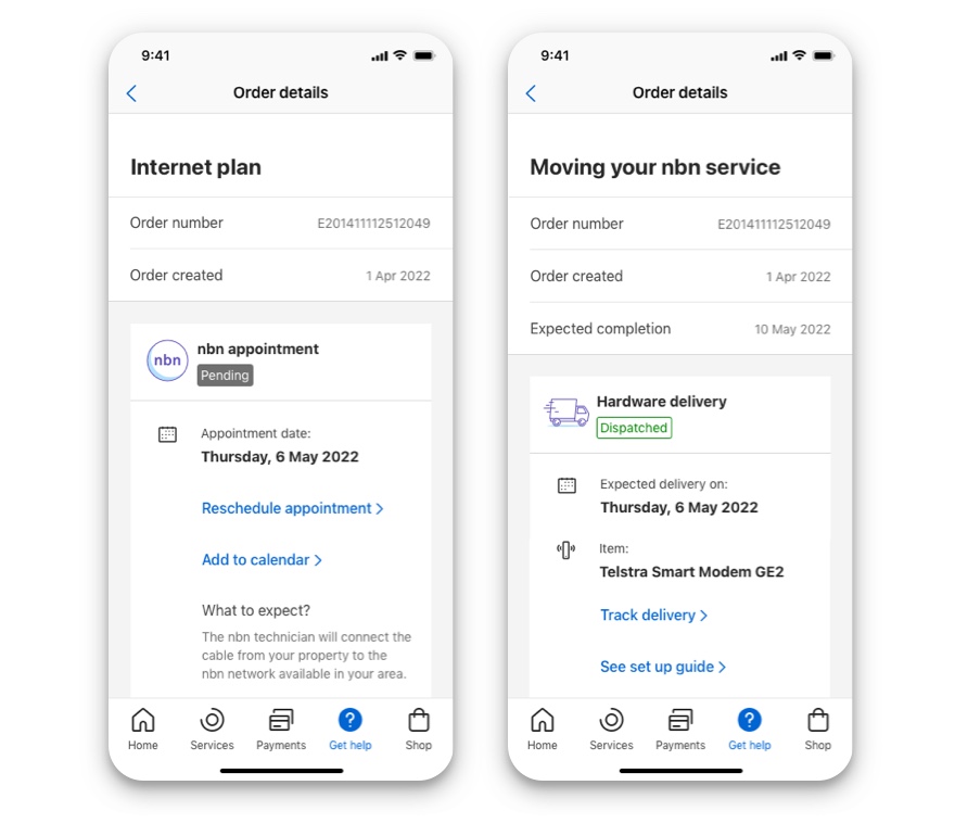
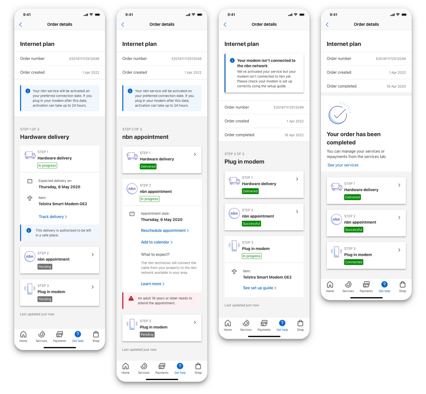
There were 3 areas that required improvement based on our review of the current experience.
1. Lack of visibility of tracking 'Current Status'
When an order has multiple milestones it is important to visually distinguish the 'Current status' as this allows users to immediately know their progress.
2. Lack of prominence in Information hierachy
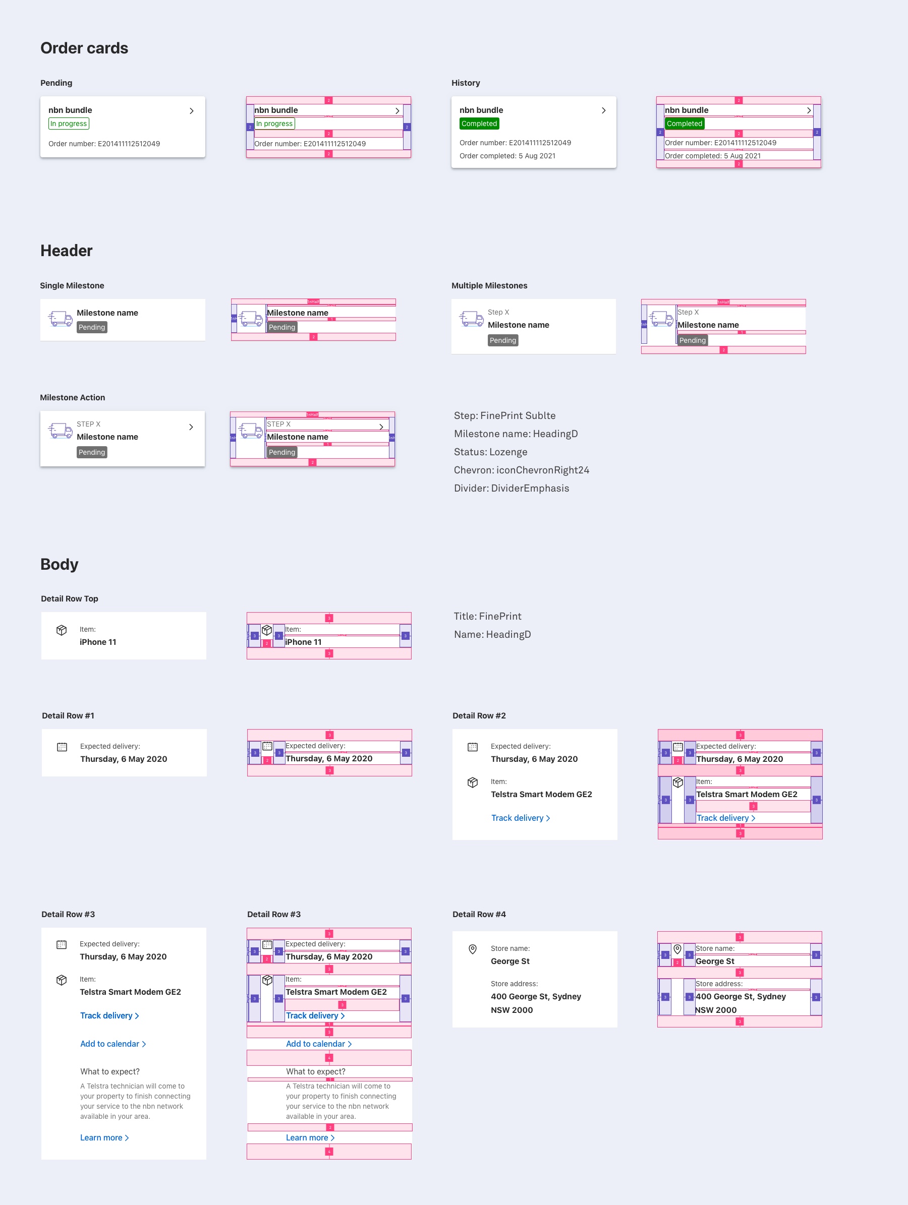
Content in the order page needs to be organized in a way that reduces the cognitive load on the user. This includes removing content that is not essential to another screen and optimising what is important.
3. Banner message prominence
Presently, only one banner message is allowed in the order. This is very restrictive as certain orders require additional information to be displayed to inform the user of changes or action they need to take.
